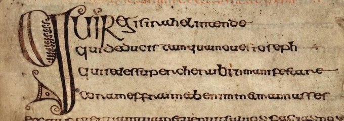
penis punctuation

Yes, yes, I know.
The title is click-baity to get people reading. But it’s true. There is phallic-based punctuation. I mean, a mark looking like a penis, and deliberately being called so.
But let’s begin at the beginning.
In classical times, there was no such thing as lower case, and no space between words SOWRITINGWOULDLOOKLIKETHIS, and readers would punctuate it themselves.
In the third century B.C., the head librarian of the library at Alexandria wanted to facilitate reading (and pronouncing) of Greek for non-native speakers who would have trouble knowing where one word starts and another ends, let alone where the boundaries of sentences (and hence nuggets of argument) were.
Aristophanes introduced diacritical marks for pronunciation like so έ . He also suggested a system of dots placed between rhetorical-grammatical parts of the sentence, so that people knew when to pause. Side-stepping the knotty issue of the difference (or not) between grammatical and rhetorical punctuation: the system included a dot at the top of the line for a final pause after a whole sentence, a dot in the middle for a short pause, and a dot at the bottom for a medial pause.
One might think of them as corresponding with parts of the sentence, like so:
DOT (full stop)
DOT (comma)
DOT (colon)

Neither the Greeks nor the Romans really took on this system (called distinctiones), but it wasn’t lost: Dyonisius of Thrax included it in his grammar of the second century B.C.; several hundred years (and a massive religio-political change) later, Christian scholar Donatus picks it up again in his influential grammar of the 4th century A.D.; and 300 years after that, scholar and churchfather Isidore of Seville revives the punctuation dot system via Donatus in his widely circulating Etymologies of the 7th century.
People still hadn’t thought of including spaces between words as aids for reading (lots of potential reasons for that such as over-familiarity with Latin and hence no need for further clarification; and trying to control who has access to the word in all its manifestations, hence excluding people who didn’t know Latin well). – Space between words seems like one of those things after which there is no going back, something that was only waiting to be “discovered”. But not yet. Not by Isidore.
The dot system did circulate slowly but surely. Isidore re-arranged the sequence of the points in a more logical way (the shortest pause dot at the bottom, followed by the medial pause, and the final pause dot at the top of the line). The comma dot was called ‘subdistinctio’ (because under the ‘disctinctio’ colon, and ‘punctus’ period dot). He also openly linked the level of dot with the grammatical-rhetorical sentence constituent of period, colon, and comma (for more on this here).
That’s interesting, but when is the penis coming?! Patience, patience.
Sometime in the course of the late 7th century, the Next Big Thing happened, and spacing between words was invented. Thank you, Irish monks, who struggled with Latin, and tried to make parsing easier! Confused by all the similar-looking syllables of Latin, and the by-then unfamiliar rhythms of sentences, insular monks would add tiny spaces between words when copying in order to distinguish one word from the other. They were generally interested in the graphic looks of the page and writing, since that was how they encountered Latin mostly: silently. As a written symbol. (Of course, there’s the liturgy which is very much aural and oral, and which needed punctuation for proper enunciation, but we won’t look at that for now).

So. We go into the later Middle Ages with some well-established customs: dots at different levels of the line, space between words, upper and lower case letters, capital letters at the beginning of sentences, lines between paragraphs, indentations, and other decorative symbols to mark one section off of another.
There was no such thing as a unified way of writing, or punctuating. Local variation in script, pronunciation, material of writing, individual habits, and kind or genre of writing meant significant overlap in approach, and general confusion or collision. Some people thought the dot system wasn’t all that useful and suggested different signs. (The penis is coming!)
The early 13th century scholar and letter writer Boncompagno da Signa, for example, proposes a two symbol system: / and __
He calls ___ virgula plana, the ‘flat wand’, and recommends it for final pauses after completing the sense of the sentence.
This / is the virgula suspensiva, the ‘suspended’ or, I think it is safe to say ‘erect wand’’, for any medial pause of whatever kind after a sentence unit whose sense is incomplete.
Yep, here it is.
Virgula means wand, little twig…and, in medieval jargon, penis.
So if you need to pause a little, but still want to keep going, you use the erect wand. Once you’re done, and have dispensed with your intellectual vigour, you can put the twig to rest flat on the line.
Boncompagno. What a joker.
The virgula was taking over far and wide, and stuck around for quite some time even in the early modern period. It’s easy to make with the quill, just a forward slash; it can easily be inserted into writing after the fact (unlike, for example, a decorative hedera or ivy leaf used to section off paragraphs). And you can’t really mistake it for anything else, an abbreviation for example (which is what happened with the dots); there’s little confusion potential (as with the dots which floated up and down the line in relation to the size of letters according to the individual habit of the scribe). It’s just…a slash. There.
Fast forward humanism and the early days of the printing press. In incunabula (early printed books between 1450-1500), you will still find the virgula, as printers and typesetters imitate the looks of manuscript books. Within one generation of printers, the art comes into its own, producing sophisticated craftsmen-scholars who explore the possibilities of the new medium in terms of offering a highly legible, elegant classically-minded look.
Venice printer-superstar Aldus Manutius did not only invent the semi-colon, but also the hook-shaped comma that we are used to today. Oh, and italics and roman type, of course.

The 1499 edition of Pietro Bembo’s De aetna printed by Aldus is a first in many ways: first to introduce the invented-from-scratch semi-colon for more subtle pausing; first to use roman type; first to use the new form of the comma.
While the semi-colon took a while to be embraced and understood, the comma and roman type took the writing world in a storm, producing similar type faces like Garamond (my favourite), or Jenson, and spreading the sexy curvy new comma all across Europe.
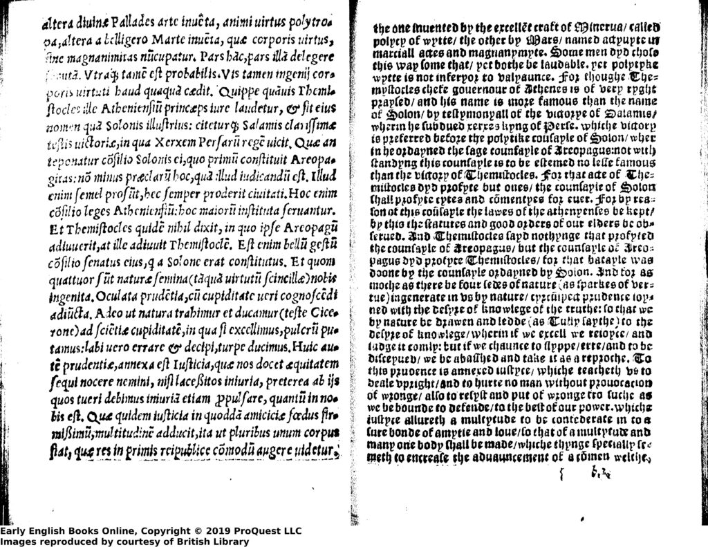
Via Paris, the comma migrated northwards, arriving in London in the 1520s (roman type had been used by Pynson in 1502, by Wynkyn in 1528). Although the virgule remained firmly attached to blackletter type, and blackletter to vernacular texts and forms, the comma invaded blackletters and was used interchangeably with the virgule for those works. Not so for humanist/Latin/roman texts which would remain populated by the stylish Italianate comma.
In 1534, Wynkyn would print his Latin-English Cicero with facing pages in roman plus comma, and blackletter plus virgule. You can see that nicely here:

In 1557, Tottel, although celebrating their new Italianate forms, prints Wyatt’s and Surrey’s English verse in blackletter (but with the Aldus comma).
At the same time, the virgule was pretty much still alive and kicking in manuscript, witness the Devonshire poetry anthology, with some of Wyatt’s verse.

In a way, the virgule is still alive, in the Italian and French name for ‘comma’.
It’s fascinating how the two marks of punctuation referring to pretty much the same phenomenon of language (a short pause) can come to symbolize so many social and cultural issues pre-occupying people at the time: new ways of learning and expression competing with old, native ways; the representation of that learning, unfamiliar looks of pages, and old crowded angular shapes; a technology standardizing how text would look like for the writing culture of an entire continent, and that within a few years, and allowing vast numbers of identical reproduction to circulate far and wide; a fascination with that technology, but also an anxiety to lose tradition, tried and trusted.
That’s why I feel so close to early modern people.
So yes, that was the penis punctuation. Can’t get any better than that! Or do we think brackets maybe look like…? Or maybe the ! like …?

Just going to leave this here until I have found (invented?) vaginal punctuation. [last updated 31 August 2022]
